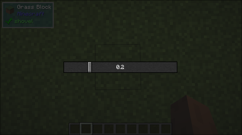
Slider
What it does
- This is just a regular slider you see in any UI.
Builder Parameters
prefix(Optional)- The prefix that will be displayed before the value of the slider
- Default: null
suffix(Optional)- The suffix that will be displayed after the value of the slider
- Default: null
showDecimals(Optional)- Whether or not to show the decimal part of the slider value
- Default: true
value(Optional)- The initial value of the slider
- Default: 0
minimum(Optional)- The minimum value of the slider
- Default: 0
maximum(Optional)- The maxmimum value of the slider
- Default: 1
onPress(Optional)- Callback that will be triggered when the slider area is clicked
- Default: null
onValueChanged(Optional)- Callback that will be triggered when the slider changes
- Default: null
Size Behaviour
- Maximum
Example
public class TestSlider implements UIComponent {

    private double value;

    @Override
    public UIComponent build(Layout layout) {
        return new Center(
            new Sized(
                Size.staticSize(200, 20),
                new Slider.Builder()
                    .withValue(value)
                    .withOnValueChanged((value) -> this.value = value)
            )
        );
    }
}
What it looks like